The creative brief for this project was delightfully simple: “flossy posse.”
Otsego Dental was sponsoring a 5K fundraiser and wanted a team shirt that prominently featured its logo while still feeling fun enough that employees would actually want to wear it.
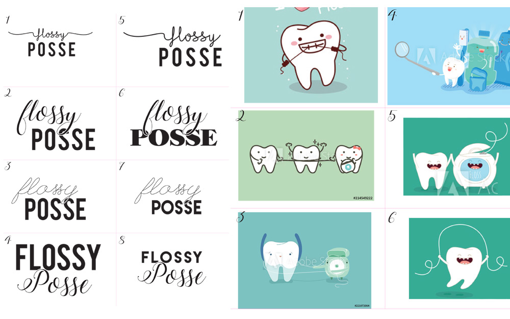
I started with a typography and imagery moodboard to establish a creative direction, then developed several concepts for the client to compare.
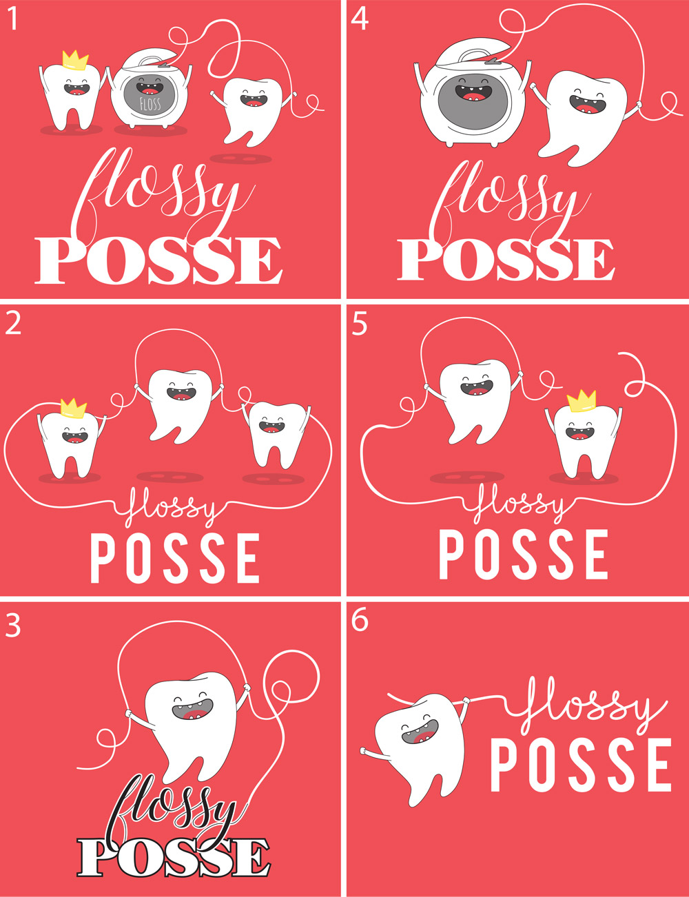
One of the final design elements was a small crown that ALMOST elevated the concept enough to justify moving from a two-color to a three-color print.
Then came a classic production dilemma: the client wondered whether to switch from the original shirt color to blue.
I proofed the design both ways and evaluated the actual print implications rather than simply choosing based on screen appearance. The deciding factor ended up being the tongue in the illustration—it worked beautifully against the salmon-pink shirt but lost impact with the blue option.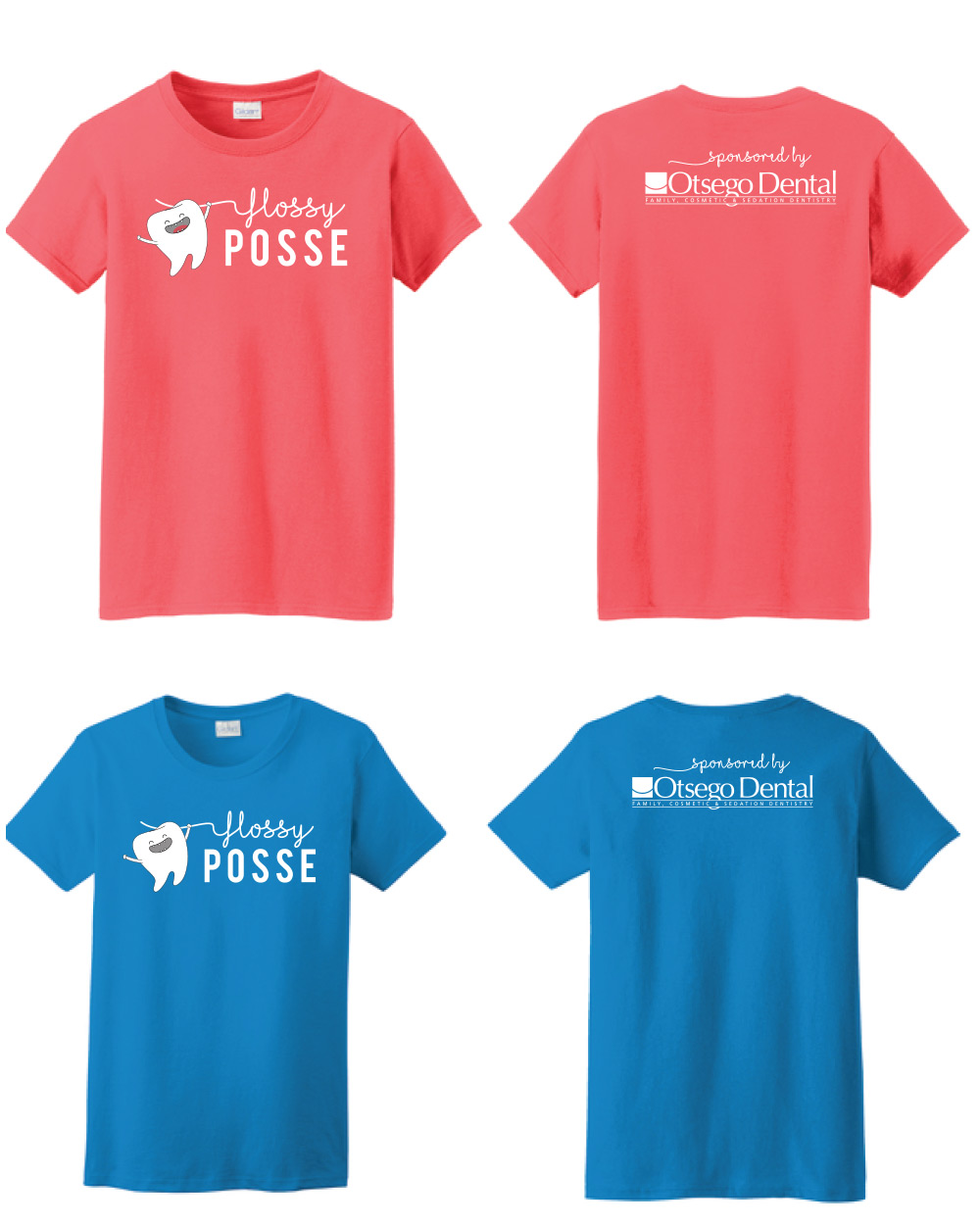
That tongue was the dealbreaker in deciding on a “salmon” pink.
It’s a small project, but it demonstrates something I enjoy about design: creative decisions and production decisions aren’t separate. The best solution considers both.