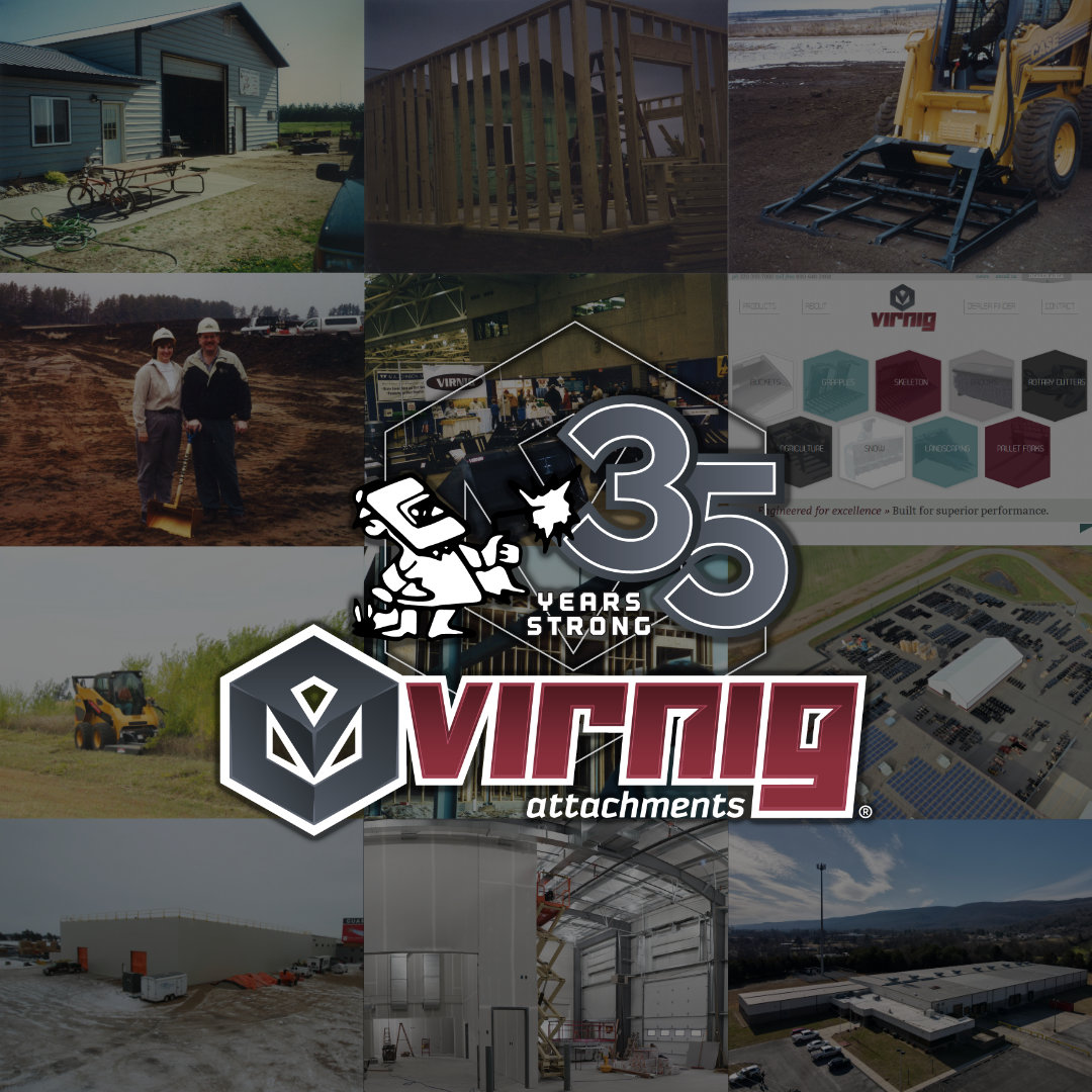
Virnig Manufacturing’s 35th anniversary was an opportunity to celebrate more than a number. It was a chance to honor the company’s roots while aligning with the brand identity customers and employees know today.

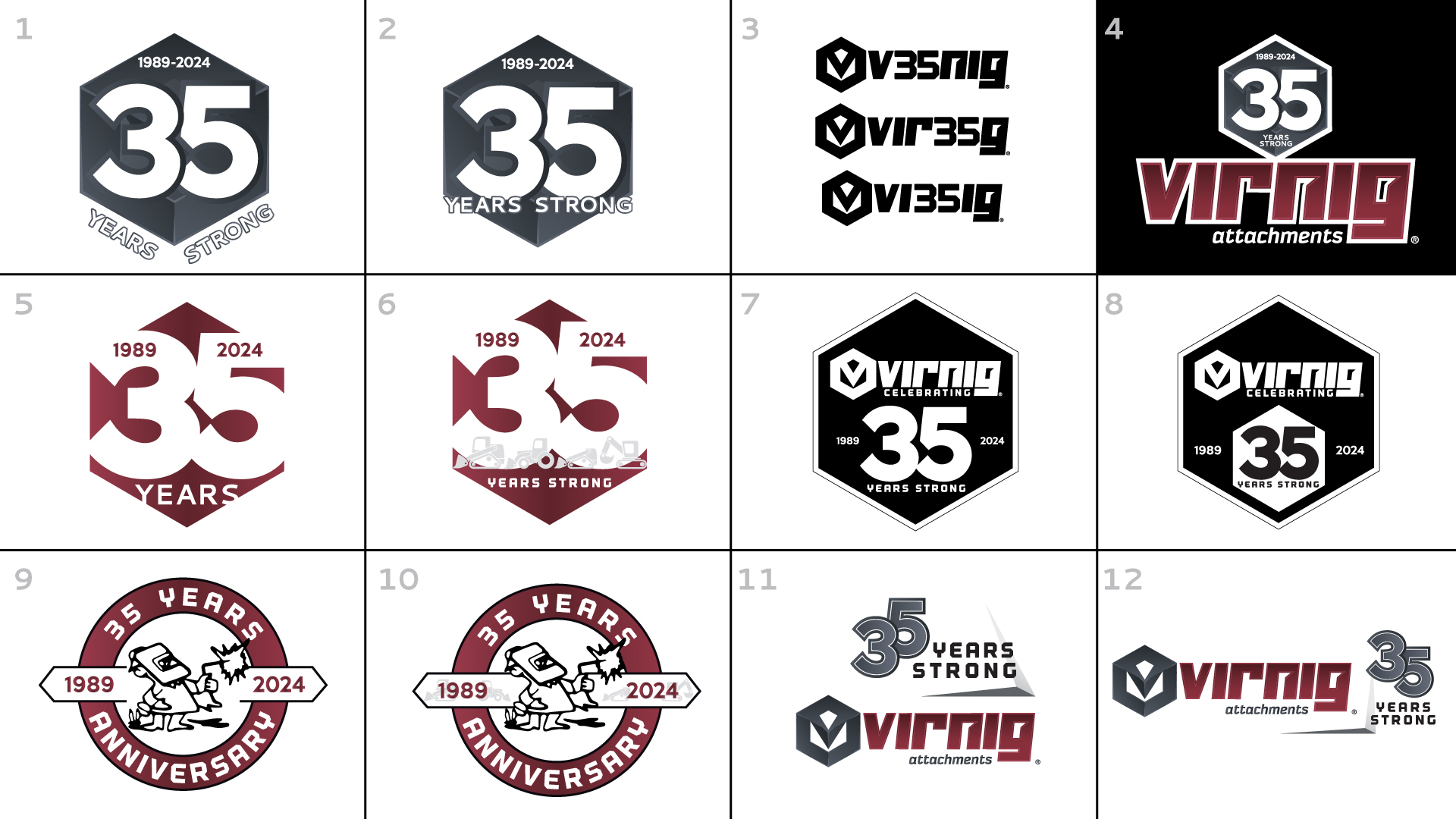
I developed multiple creative directions, intentionally exploring a range of visual approaches. Presenting distinct directions, from playful concepts to more traditional badge-style marks, allowed the team to react to different interpretations of the anniversary rather than simply approving or rejecting a single idea.
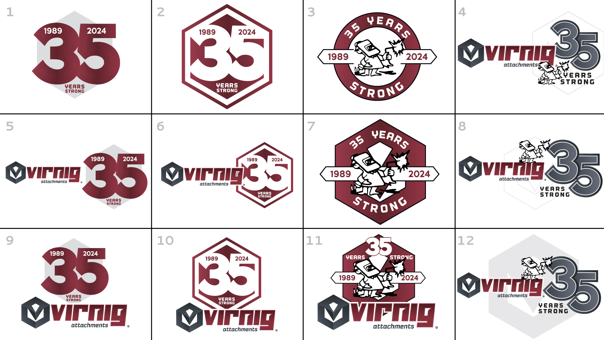
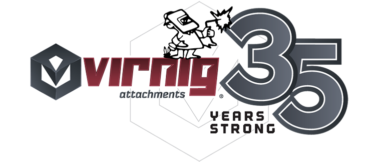
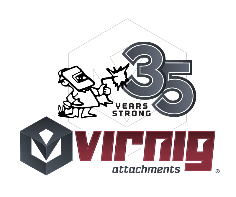
The selected concept incorporated one of Virnig’s earliest brand elements: the classic “welder man.”

I reinterpreted the nostalgic figure within a cleaner composition and paired it with modern typography and a clean presentation of the 35-year milestone.

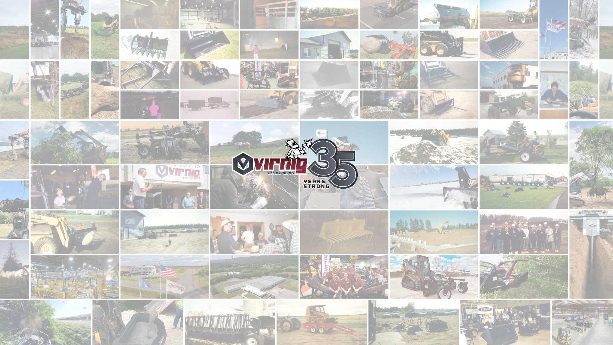
From there, the logo became a flexible brand asset used across internal communications, event promotions, apparel, promotional materials, video, and social media.

This project was a good reminder that effective branding isn’t always about creating something new. Sometimes it’s about understanding which pieces of a brand’s history are worth preserving, which need to evolve, and how to make them meaningful to today’s audience.

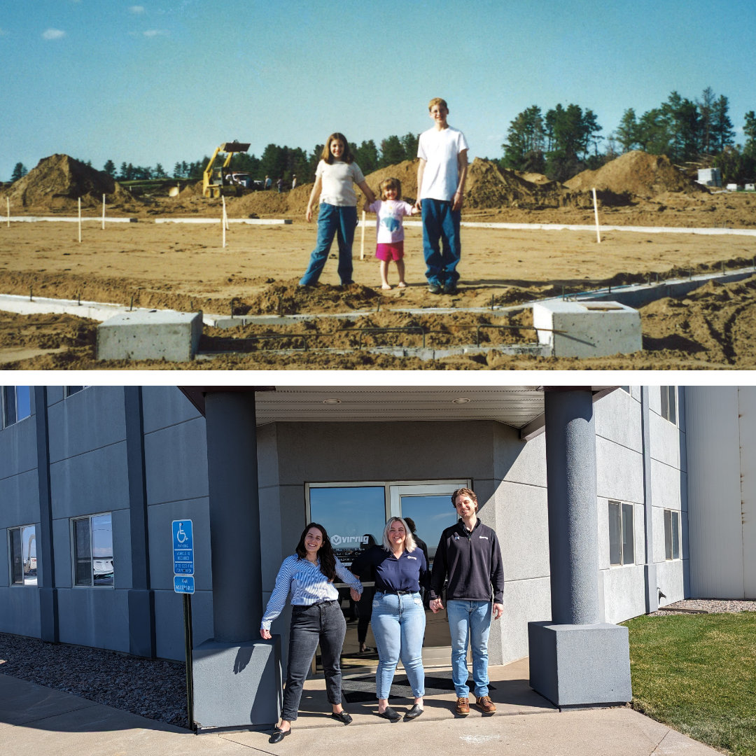
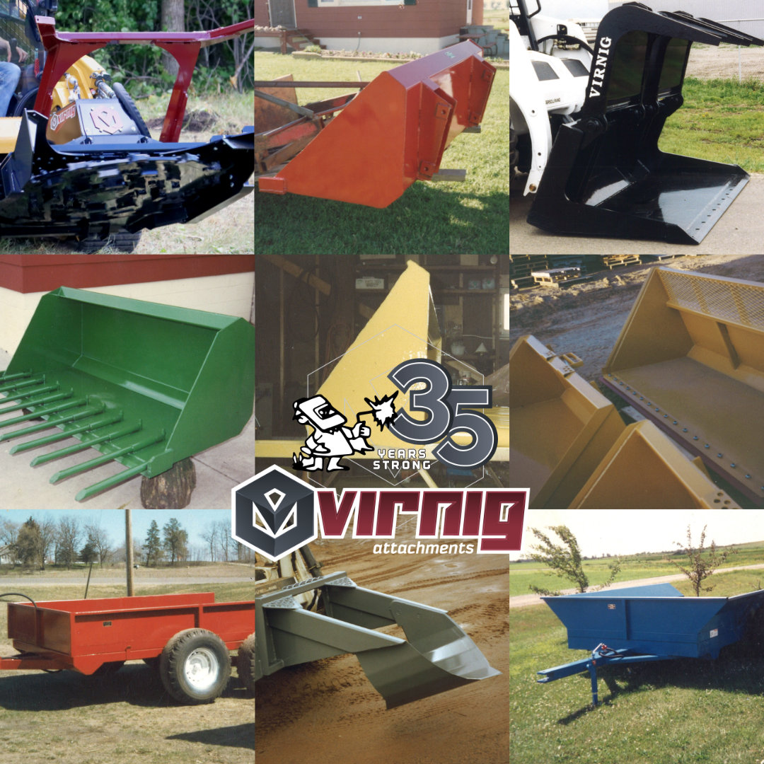
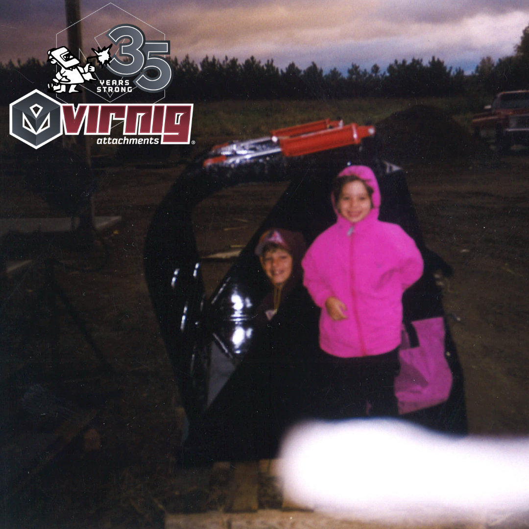
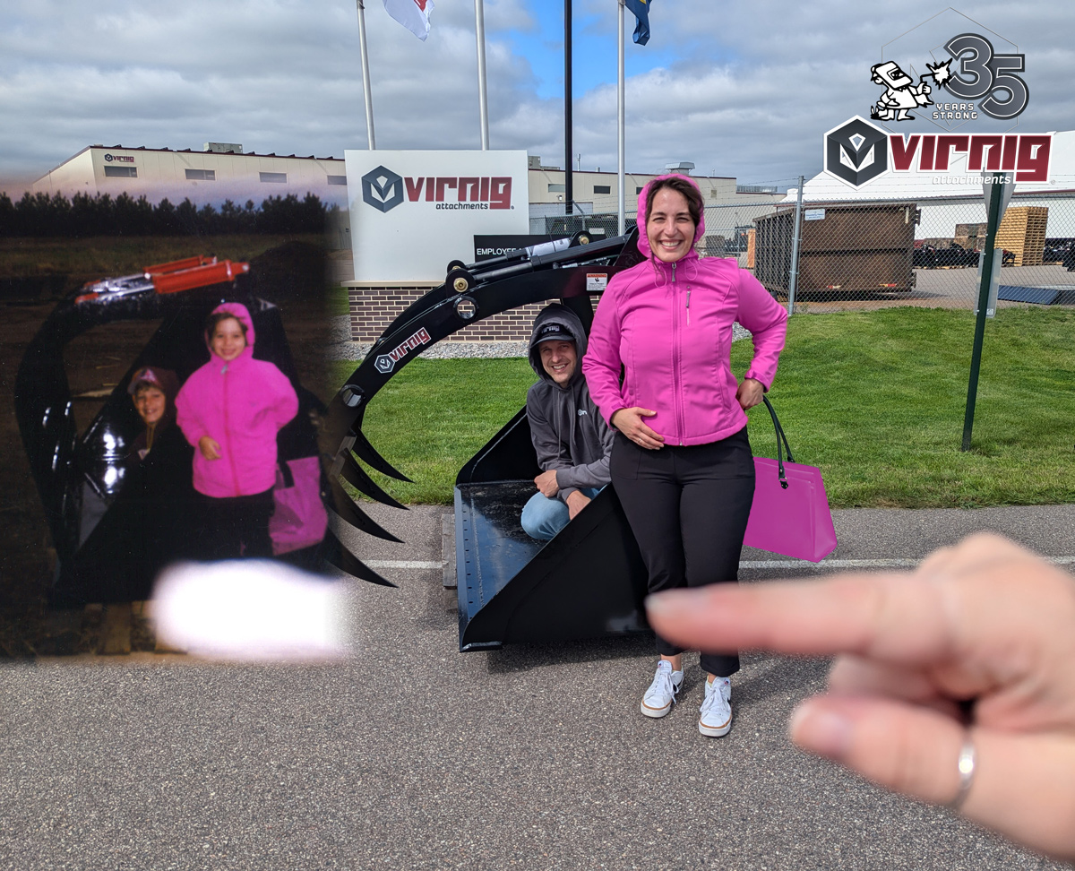
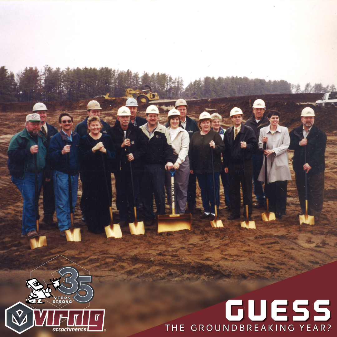
Below are a few of the many social posts I crafted throughout the year that celebrate our history and milestone. We had fun with interactive games, trivia, and recreating throwbacks. We included employees, dealers, and end users in our festivities, and celebrated the entire year.