
The Process
The first step was to investigate AZOAT’s old website and evaluate strengths and weaknesses. I asked for key information about the target clientele and overall desired impression. I also took a look at competitor sites to help gain an understanding of the market.
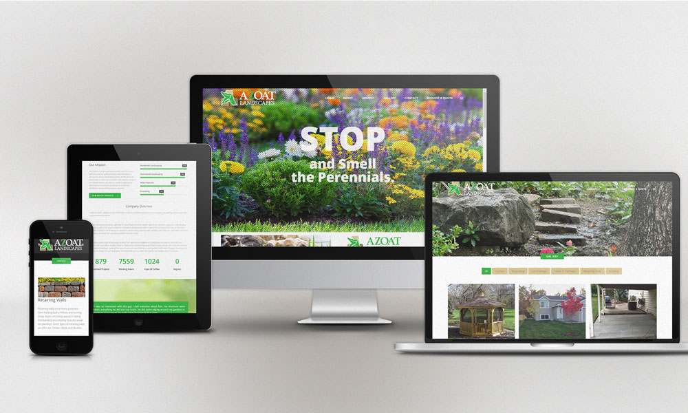
The next step was to lay wireframes, or mockups. I provided examples and we went with a look & feel that Zach chose and I implemented. I used a combination of imagery from job sites and stock photography and slowly built up the pages, copying content from the old site and rewriting it into the new.
This was a very smooth process because I had creative freedom to interpret content however I thought best. I worked from mobile to desktop, scaling my browser constantly to keep control of the responsive behavior of the site. I created new images for mobile pages that are hidden on any other device. I rewrote key content to better portray an inviting, professional, friendly tone.
Since this site was developed with an incredibly user-friendly backend, the final step is to hand over the reins. Business owners typically prefer full control, so they are provided full instruction on updates and new content. They’re no longer dependent on a developer or IT guy to keep their site current with the latest news.


