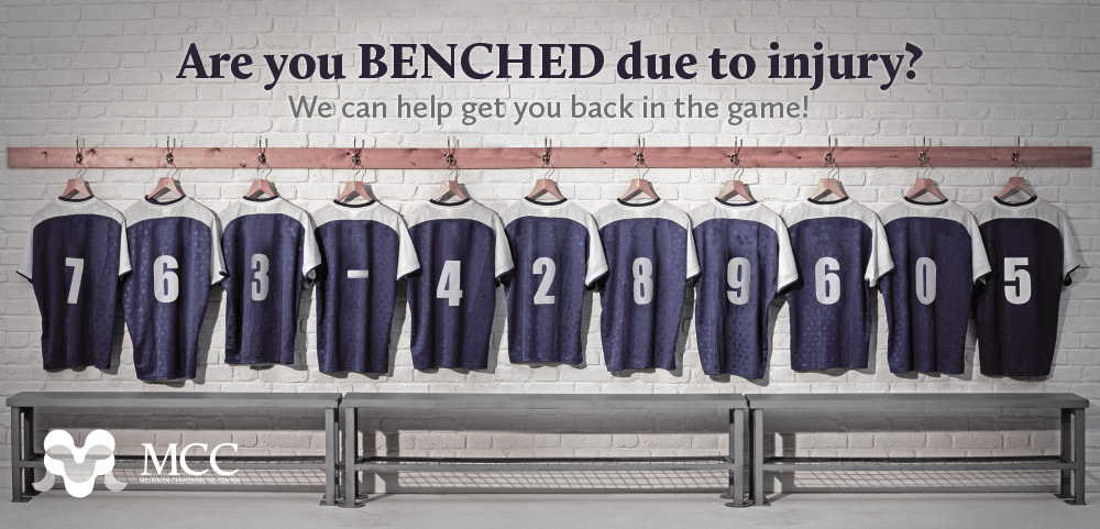
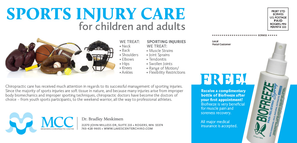
This was an EDDM mailer with some heavy Photoshopping and an attention-getting call to action on the back. I added the phone number to the jerseys and luckily the client LOVED that idea! I encouraged size 6″x11″ because I had just sat through a USPS webinar on mailings. Evidence suggests the larger the piece the better the return on investment. 4×6″ postcards statistically perform the poorest.
I also created the logo, an abstracted “M” that references vertebrae.
- Branding
- Copywriting
- Layout
- Photoshop


